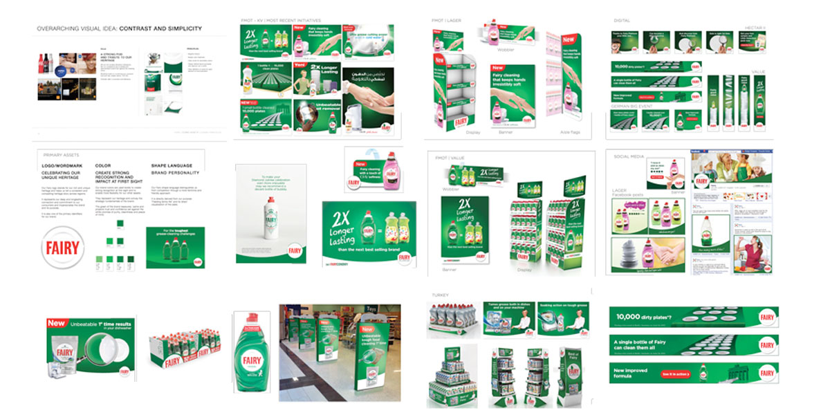

Iconic design makes the idea as clear as possible, in part by editing and simplifying. It makes the brand consistent and unmistakable, but also ensures the brand is never predictable. It gives the brand unlimited potential to surprise and delight.
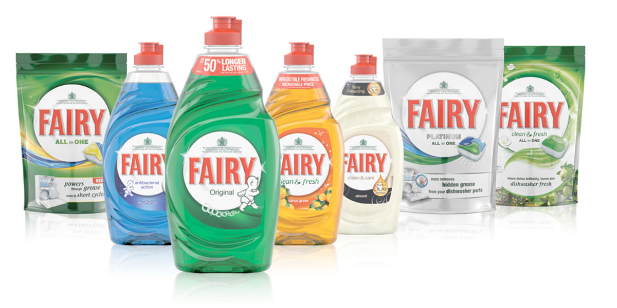
product range
The Fairy Story
A full family life is busy, energetic and fun, but comes along with a certain amount of chaos. Doing the dishes is not only a chore to be done, but a ritual that is truly part of family life. It has a lot of meaning such as caretaking, love, nurturing, support and restoring order so that your next family moment can happen.
The Fairy bottle on the kitchen sink is a constant in the busiest and most chaotic room in the house. A rock on which family life can be built, trusted and reliable but also a friendly face to turn to. Fairy liquidity is purposeful, powerful and concentrated, handling the mess that comes with family life effortlessly, restoring order and control to truly support you in your family life.
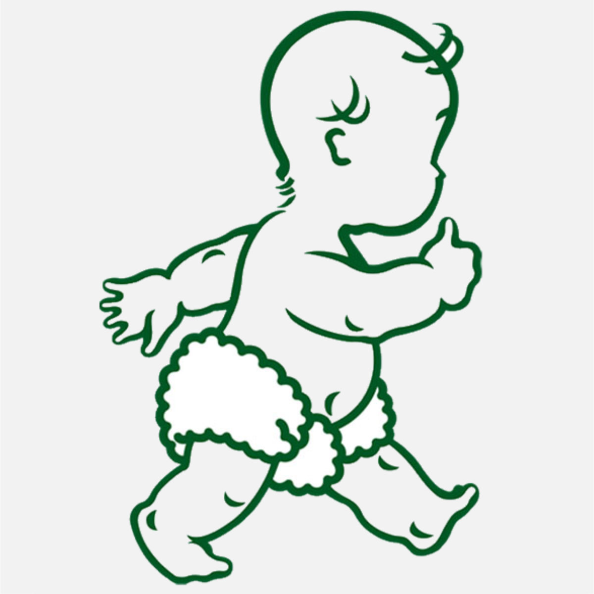
The green of the brand reassures, calms and projects trust and confidence, set against the white promise of purity and cleanliness and peace of mind. Fairy cleans to a spotless shine, in which family life can be reflected. Our icons give the brand a human face.